DataFrames, plots, and visualizations
Now, it’s time to deal with DataFrames, so let’s comment on something and continue exploring widgets.
DataFrame is the name that the pandas library gives to its data. When a file, such as a CSV file, is imported into pandas, the result will be a DataFrame. We can think of a DataFrame as an Excel or Google Sheets table – that is, a piece of data made up of columns and rows. Columns are the features or variables and rows are the records or cases. So, to keep things simple, we can say that a DataFrame is a data structure made up of columns and rows.
First, we need to install pandas, with the following command:
pipenv install pandas
If you followed our suggestion and are using pipenv for virtual environments, run the following command:
pip install pandas
If you are using a plain, standard Python installation, then write the following code:
st.header(“Dataframes and Tables”)
import pandas as pd
df = pd.read_csv(“auto.csv”)
st.dataframe(df.head(10))
First of all, please consider that all the files used in this book are available in its GitHub repository, including the auto.csv file. Now, let’s comment on the code.
First, we import pandas, a powerful library for data/datasets management, with the pd alias. After that, we load the auto.csv file into a variable named df (which stands for DataFrame), and then we visualize the first 10 rows of the DataFrame (its head) with the dataframe widget.
The result is shown in the following figure:
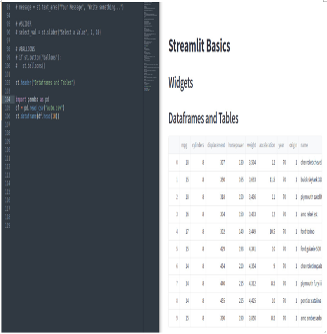
Figure 3.26: The st.dataframe widget
As we can see, thanks to st.dataframe, we can visualize the CSV file in a very nice format, with all the columns and rows similar to a Microsoft Excel sheet. If we go to the bottom or the right part of it, we can scroll left/right and up/down. Moreover, we have the opportunity to maximize the DataFrame!
If we prefer, we can visualize the DataFrame in the table format since, out of the box, we also have a nice table widget. Unfortunately, in this case, it’s not possible to scroll our data.
So, let’s say we write the following:
st.table(df.head(10))
Then, we’ll get the following table:
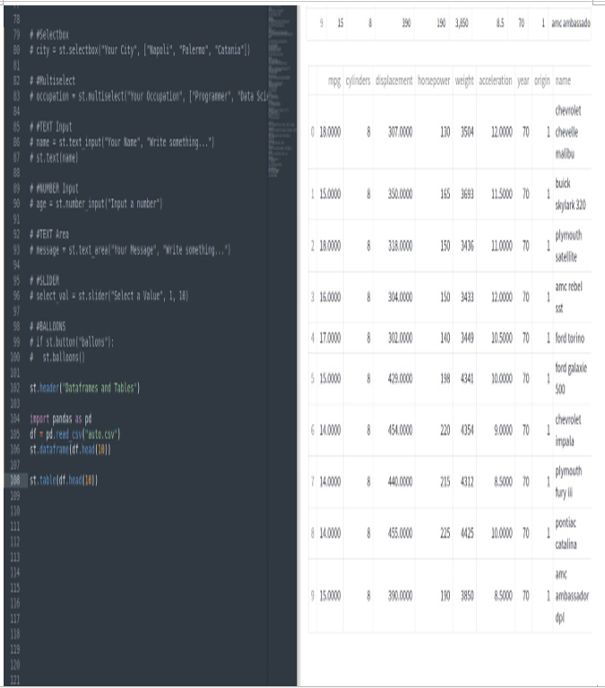
Figure 3.27: The st.table widget
Out of the box, Streamlit can also manage plottings – for example, we can show area, bar, and line charts. All we need is a DataFrame.
Streamlit, together with the plottings, automatically displays the list (in different colors) of all the visualized variables (please note we are using just “mpg” and “cylinders”).
Here, we can use the DataFrames we loaded in the previous example.
So, let’s write the following:
st.area_chart(df[[“mpg”,”cylinders”]])
We’ll get the following area chart:
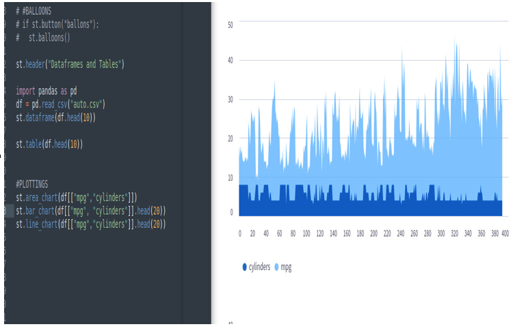
Figure 3.28: The st.area_chart widget
Let’s write the following:
st.bar_chart(df[[“mpg”,”cylinders”]].head(20))
Then, we’ll get the following bar chart:
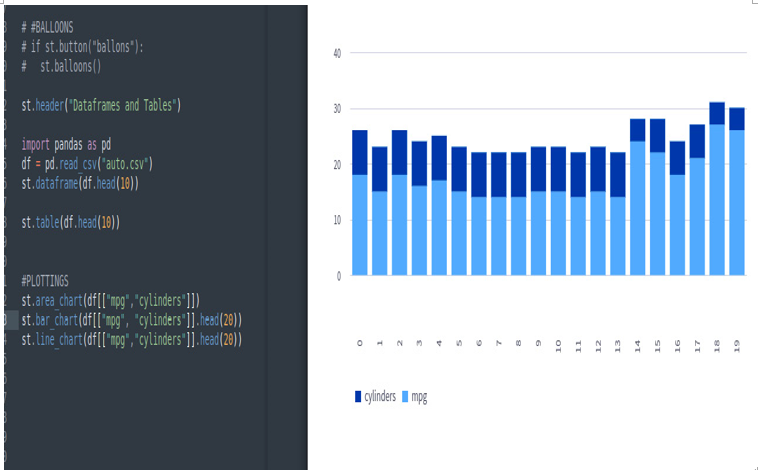
Figure 3.29: The st.bar_chart widget
Let’s write the following:
st.line_chart(df[[“mpg”,”cylinders”]].head(20))
Then, we’ll get the following line chart:
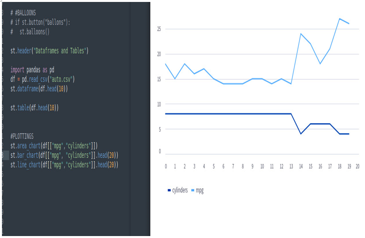
Figure 3.30: The st.line_chart widget
If we enter the charts, we can zoom in and out. By clicking on the three dots at the top right of each plotting, we can save the charts as PNG files, view the source, and perform some other operations:
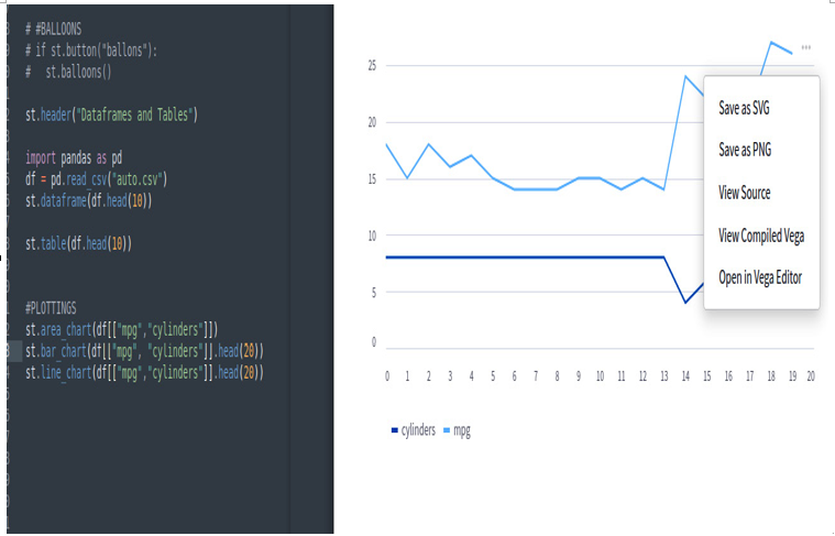
Figure 3.31: Out-of-the-box plotting functions
Finally, as we saw with DataFrames, we can maximize all the charts to see them fullscreen:
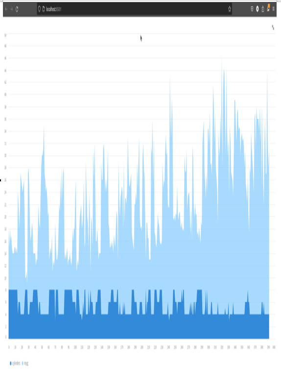
Figure 3.32: Fullscreen plotting
With Streamlit, we can plot much more beautiful graphs using the matplotlib and seaborn Python packages. So, first of all, let’s install these packages:
pipenv install matplotlib seaborn
If we are in a pure Python environment, we can run the following code:
pip install matplotlib seaborn
At this point, we can import these packages, like so:
import matplotlib.pyplot as plt
import seaborn as sns
Now, we are ready to start plotting. Here, we’re plotting a heatmap of the correlation matrix of our DataFrame:
fig, ax = plt.subplots()
corr_plot = sns.heatmap(df[[“mpg”,”cylinders”, “displacement”]].corr(), annot= True)
st.pyplot(fig)
The first instruction creates an empty figure. The second line, leveraging seaborn, creates a heatmap plotting (with annotations) of the correlation matrix coming from the variables in the df DataFrame. Finally, the third command plots our figure using matplotlib.pyplot, which is directly managed by Streamlit. Here is the result:
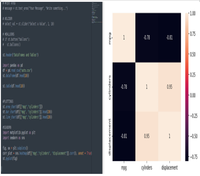
Figure 3.33: Heatmap plotting with Seaborn
Please note that we have displayed the correlation plot with labels and the heatmap with colors and annotations.
